 To Daniel MacGhie Cory
Rome. November 25, 1936
Dear Cory,
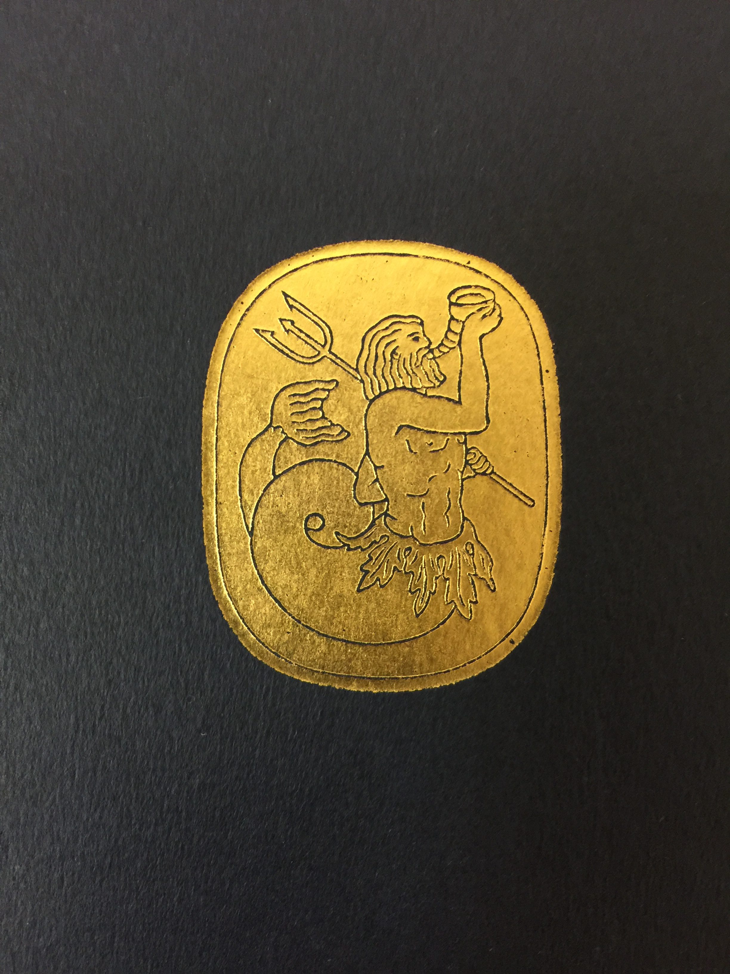
The Triton arrived two or three days ago. I agree with what you say about it, and in many ways feel relieved and content. They have avoided all splurge and vulgarity. The fancy name of Triton Edition is itself inconspicuous, and the cameo of the Triton small and distinguished. The title page and Anderson’s drawing opposite I like extremely: they have managed the thing to perfection. Then I found that the first volume, though rather heavy to hold (I can’t read a book layed flat on a table) tempts the eye, and keeps one reading. That must mean the functional perfection of paper, type, and arrangement of the page. But here I came upon something that perhaps points to another trait of the artist-publisher. My marginal headings are printed in large type across the page at the top of each paragraph. This suggests something which my writing is not. The paragraphs are only divisions in one discourse: they are not answers to stated questions or separate compositions. Probably this new arrangement will help the reader in that he will be satisfied to begin anywhere and read a paragraph: and that I believe is the way in which my style, if not my doctrines, may be best approached. But on the whole the change is a perversion, and marginal notes are an old device which has a special relish of its own. And now another symptomatic thing. The binding, for a 10 dollar volume, is most modest. Except for the gilded Triton, it might be taken for a temporary cover to a sewn volume, as yet unbound. The label is very nice–parchment, I suppose–but it seems to imitate paper. And the very dark blue sides and the very soft grey back–is that a fashion or a caprice? I seem to smell a rat here: The terror of not being in perfect taste. Mincing, apologizing, consciousness that one might go wrong. Now an édition de luxe should be gayer and bolder than that. Never mind a questionable flourish here and there, but have verve have go, dare to be lavish. In that way, I like Pierre la Rose’s edition of Lucifer better than this one. He plunged. In the Renaissance books could be magnificent. This is only perfectly neat, come from the best tailor and the best barber, and most anxious to look like a gentleman. Don’t feel too athletic. Feel that this get-up [across] isn’t swagger enough. But I repeat that I like it extremely in its way, and think they have made, in their own style, a perfect success of it. Yours affly
G.S.
From The Letters of George Santayana: Book Five, 1933-1936. Cambridge, MA: The MIT Press, 2003.
Location of manuscript: Butler Library, Columbia University, New York NY.